_edited.jpg)
What We Are Solving
Panorama had no unified design system. Over the years, multiple people across the Panorama team created scattered components, icons, and color palettes without clear guidelines. This led to confusion, delays, inconsistent designs, and slower UX workflows.
How We Solved The Problem
we built the first centralized design system for Panorama by auditing existing assets, standardizing components, and defining clear usage guidelines. Working closely with the Panorama team, we created reusable components and documented standards to ensure consistency and scalability.


Impact We Created
The new design system cut design time by 50%, improved collaboration efficiency by 40%, reduced handoff delays by 60%, and delivered a consistent user experience across 80% of the product.
Creating Order from Chaos: Panorama Design System Overhaul
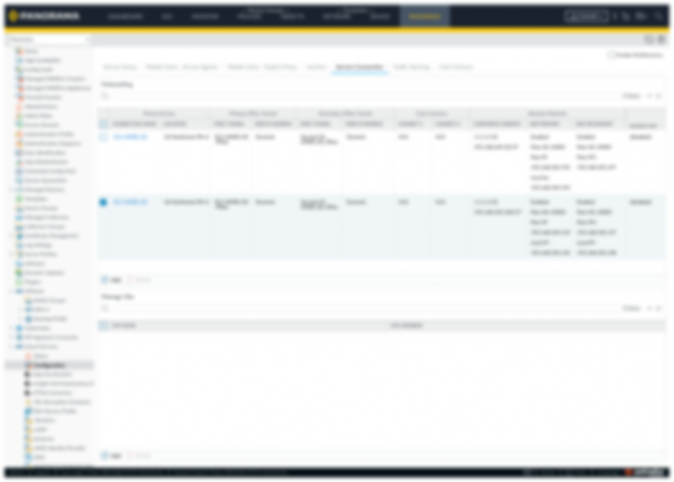
Panorama is Palo Alto Networks’ flagship platform for centralized visibility and policy management, unifying security operations across physical, virtual, containerized, and cloud deployments through a single pane of glass.

Product
-
Panorama Design System
-
Network Security
-
Web Application

Duration
-
3 Months
-
May-July, 2024

Team
-
Design Lead
-
Staff UX Designer
-
UX/UI Designer (Me)

Tools

_svg.png)


My Contribution
Conducted research by analyzing existing UIs, provided actionable insights to the team, and created reusable components and variables to build a scalable design system.
_edited.jpg)
Project Overview
We designed and developed a centralized design system for Panorama, a legacy product that previously had no unified standards. The project involved auditing existing UI elements, creating reusable components, defining clear usage guidelines, and collaborating with the Panorama team to ensure consistency and scalability. The new design system streamlined design-to-development handoffs, improved collaboration, and brought visual and functional consistency across the product.
Product
Panorama
Design System
Duration
3 Months
May-July-2024
Design Lead
Staff UX Designer
UX/UI Designer
My Role
Conducted UX research and built reusable components and variables for scalable design systems.
Tools

_edited.jpg)
What we want to achieve ?
-
Build a unified design language for a consistent user experience
-
Eliminate design discrepancies across products and platforms
-
Accelerate development with reusable components and clear guidelines
-
Enable rapid prototyping for faster idea validation
-
Simplify collaboration across design, development, and product teams.


Colors
The original color palette was limited and inconsistent, often requiring ad-hoc selection with a color picker. We streamlined the system by cataloging all colors used in the product and organizing them through a design token framework.

Typography
We retained the Lato and San Sherif font family to maintain typographic consistency, ensuring a cohesive and harmonious visual experience throughout the design.

Layout and spacing
We retained the Lato and San Sherif font family to maintain typographic consistency, ensuring a cohesive and harmonious visual experience throughout the design.
Building Blocks Of Design System: Foundations
We identified multiple inconsistencies across text, spacing, color usage, icon styles, duplicates, cards, and padding variations. To resolve these, we started by defining foundational elements, including text guidelines, spacing standards, and a unified color palette.
Design System Breakdown
To keep things clear and organized, we used variant tables to document the basics of each component. Every foundation page had its own table for details, and panels helped structure the content so everything was easy to find and follow.
Design Token
Design tokens serve as the building blocks of design system, storing visual attributes to maintain consistency and scalability across the product.
Numeric Value -They are used to define tone and shade ranges, and to ensure the system scales seamlessly if colors are updated.


Color System
We organized Panorama’s color palette into action, text, background, and accent colors. This made it easier for users to recognize different states like default, hover, or selected at a glance.


How We started
Our process began with a thorough review of the existing UI, carefully examining key elements like fonts, colors, and padding to understand the current design foundation.
_edited.jpg)

What Next?
Next, we built a scalable component library guided by the Atomic Design approach, with standardised naming and clear organisation for long-term consistency.
We built a library of UI components including buttons, accordions, icons, navigations breadcrumbs, drop downs, navigation bars, loaders, master pages, and more and continuously expanded it as new requirements and features emerged.

Some of the components
Master Page
Master Pages: Frequent feature updates often slowed us down introducing master pages reduced handoff time by 70% and made the process much smoother.
Size Guidline

Due to NDA restrictions, detailed components and pages cannot be published but can be reviewed and discussed during meetings.
Learning and Conclusion
My Learning
Working on a design system means teaming up with designers and product folks, combining different perspectives to build a single source of truth. It’s rewarding to see how this makes design simpler, faster, and more consistent for everyone.
Conclusion
Implementing this design system ensured consistency and quality across Panorama while streamlining collaboration for the entire team. It unified scattered assets, standardized components, and gave everyone a shared foundation to design and build more efficiently.