Reimagining SD-WAN Device Port Configuration: Streamlined Forms, Clearer Views, Smarter Devices – Transforming Complexity into Clarity
SD-WAN (Software-Defined Wide Area Network) uses software-defined networking to securely connect users, applications, and data across locations. It boosts performance, reliability, and scalability while simplifying WAN management with centralized control and visibility.
Features planning and prioritization
I identified and categorized essential features across list views, port status, and configuration forms. Collaborating with the product manager and developers, I prioritized these features based on business needs and technical feasibility.


John Isaac
Network Engineer
As a Network Engineer, I test and deploy SD-WAN solutions to ensure network reliability, security, and scalability. I work closely with IT teams to implement manageable systems, troubleshoot issues, and develop best practices and playbooks for consistent network operation. I also evaluate vendor solutions to recommend the best fit for our growing infrastructure.

Problems Identification
-
The device illustrations lacked clarity, with weak color contrast and minimal cues, causing confusion around ports and device states.
-
Unintuitive configuration forms made setup confusing, error-prone, and time-consuming for users.
-
List views were cluttered yet uninformative, leading to user frustration and inefficient navigation.

Solutions
-
Improved Usability: Users completed configuration tasks faster, reducing frustration and support requests.
-
Enhanced Clarity: Clear visuals and better-organized information helped users quickly understand device states and key data.
-
Streamlined Navigation: Simplified flows and cleaner layouts made it easier for users to move through tasks without confusion.
-
Higher Efficiency: Overall workflow efficiency improved, saving time for both users and support teams.

Impact
By streamlining navigation and improving usability, the project reduced configuration time by 30% and increased client reported satisfaction by 60%, enhancing overall user experience and workflow efficiency.

Product
-
Prisma SD-WAN
-
Network Security
-
Web Application
-
SASE

Duration
-
2 Months
-
March-April, 2024

Team
-
Design Lead
-
UX/UI Designer (Me)
-
2 PMs
-
UI Engineer

Tools


My Contribution
I led the end-to-end redesign of SD-WAN device Port configuration researching users, analyzing competitors, and running heuristic evaluation to transform key flows. By creating reusable components and actionable insights, I redesigned user flows to fix usability issues and deliver a smoother, more intuitive, and visually cohesive experience

Project Overview
Prisma SD-WAN, originally built by CloudGenix before joining Palo Alto Networks, had a confusing interface and scattered information that made workflows inefficient. Users often found device port configuration frustrating, navigation messy, and list views unhelpful, which led to complaints and wasted time. Over the years, features were added without a clear plan, creating inconsistencies and slowing development. The solution involved redesigning device port configuration, improving visuals, reorganizing information, and adding thoughtful new features resulting in a cleaner, more intuitive, and user-friendly experience.

Project Aim
-
Simplify SD-WAN device configuration for network engineers.
-
Streamline navigation to reduce confusion and setup time.
-
Improve visuals for better clarity and usability.
-
Organize information in list views to make key data easy to find.
-
Reduce customer complaints by delivering a smoother, more intuitive experience.
Design Approach

Discovering The Challenges & Opportunities
In the Discovery Phase, I focused on understanding the product and gathering insights to guide data-driven design decisions for SD-WAN device port configuration, with the goal of creating a unified and seamless user experience.
Understanding prisma SD-WAN device
Before starting any project, it’s crucial to understand the product in depth. I took the time to learn how it works, how network admins interact with it, and where they face challenges. By exploring real workflows, reviewing the setup process, and identifying pain points in the existing UI, I was able to ensure that my redesign would simplify the experience while meeting both user needs and technical requirements.

Jira ticket analysis
I gathered all the Jira tickets raised by customers to analyze and identify the key issues they reported.

Stakeholders interview
After reviewing Jira tickets, I conducted interviews with direct and indirect stakeholders including support engineers, product managers, and technical marketing teams working closely with SD-WAN customers. Their insights into customer interactions and pain points revealed recurring issues, user frustrations, and key opportunities for improvement.

Heuristic evaluation
Heuristic evaluation was conducted to uncover usability issues in the existing application. Key issues identified include:
-
Lack of visual cues for port status.
-
Repeated information in the interface list view.
-
Missing IP address details in the list view.
-
The “More information” icon doesn’t reveal additional details when clicked.
-
Overuse of nested cards, creating a cluttered experience.
-
Inconsistent port display between dark and light themes.
-
Multiple scrolls are there in limited space
-
proper space was not utilised to accommodate more information.
-
Broken experience are there.
-
Many important information were missing in the list.
-
There is no option for customisation (Information view) for the users in list view.
These are just a few of the usability issues we discovered through heuristic evaluation and a basic UX audit.


Competitive analysis
Competitive analysis for B2B products often lacks publicly available details. I managed to gather interface screenshots from competitors like FortiGate, Cisco, and Aruba, focusing on device display screens to explore potential opportunities for outsourcing specific services.
Key Findings - Port Status, Legends is there, Color Code for port status etc.

Time to address the Problems

The Problem -1
The device illustrations lacked clarity, with weak color contrast and minimal cues, causing confusion around ports and device states.

The Solution
To address this problem, I designed a 3D device view inspired by the actual hardware, using proper color contrasts and status indicator along with legends.
Solution Approach
The process starts with a thorough examination of the physical device, documenting how each port is represented, the total number of ports, and collecting detailed information about their functions and status to inform the design. I also created Components for the ports which is added to the Palo design System.


The Problem - 2
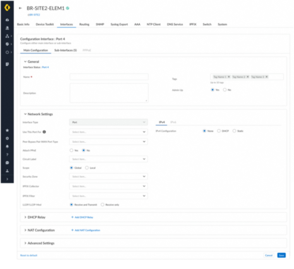
Unintuitive configuration forms made setup confusing, error prone, and time consuming for users.

The Solution
To address this problem, I redesigned the interface to utilize the entire page, removing nested cards, unnecessary scrolling, and irrelevant information during port configuration. Sections were reorganized and categorized to create a more intuitive user experience.
Solution Approach
I began by collecting all screens related to the configuration form and incorporated new features identified during the define phase. Multiple iterations were created based on feedback from stakeholder meetings to refine the design.


Before

After


The Problem -3
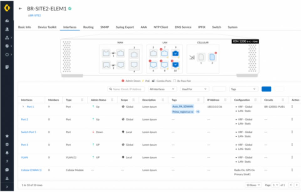
List views were cluttered yet uninformative, leading to user frustration and inefficient navigation.

The Solution
To address this issue, I removed duplicate information and redundant features while adding new functionality to enhance the user experience.
Solution Approach
I began by collecting all screens related to the list view and reorganizing the interface. I incorporated features identified during the define phase and discussed in stakeholder meetings, including IP display, member ports, expand/collapse, and column rearrangement. These enhancements aimed to give users more control and a customizable view. Multiple iterations were conducted based on stakeholder feedback to continuously refine the design and improve overall usability.

Before

After

Due to NDA restrictions, all screens and prototypes cannot be shown here but can be presented in a personal meeting.
The top solutions for each problem were finalized and prepared for implementation, along with detailed engineering specifications for development. Later, the project became part of the 6.1.2 feature release at Palo Alto Networks.
My takeaways
Situation
When I joined, the project lacked a unified Product Requirements Document (PRD). With only a brief PM-created document and multiple PMs involved, unclear requirements made it difficult to establish a clear project direction
Task
My first priority was to clarify the project’s objectives—defining the problem, target users, and success criteria—before moving into the design phase.
Action
I engaged the senior UX manager to align stakeholders and proposed a structured kickoff process to overcome time zone challenges and bring all PMs and engineers together.
Collaboration
I aligned early with PMs on product vision, user needs, involving them in research, usability testing, and regular reviews to ensure user-centered, business-aligned designs.
With engineers, I collaborated from the start on technical feasibility, iterated closely during development, and clarified design specs to deliver practical, high-quality solutions.
Learning
This project reinforced the power of cross functional collaboration. Early and continuous alignment with PMs and engineers understanding user needs, and technical constraints allowed me to create practical, impactful, and user-centered solutions. Iterative feedback and clear communication were key to ensuring the designs truly worked in practice.